After visiting the design centre in Chelsea, I then began to travel around London using the tube. I love the tubes in London, the rush and perhaps uncertainty of where you are going is all part of the experience, through this I began to record all things that interested me, the different patterns and textures you have in different tube stations within London. Some are more modern whereas some are slightly outdated.


Steps – Shoreditch overground
I really liked the patterning on the steps of each tube station. These are patterns that I would like to take forward and introduce into my field project of the Journey through the city.
I think these patterns they could be a good way of representing an adults journey through the City. This would be a different take on to an adults rather than the abandoned hope like we have previously mentioned, but a way of showing design in our lives and how we represent ourselves. Buildings within a city tend to be inviting and intriguing, it is only design that attracts one to buy an item or find out what the building offers?
I also think that the way we represent ourselves as an adult is influenced by design or designers. For example the city has jobs, for a job interview you tend to wear acceptable clothes to be seen as professional.These designs within the steps I think show efficiency.
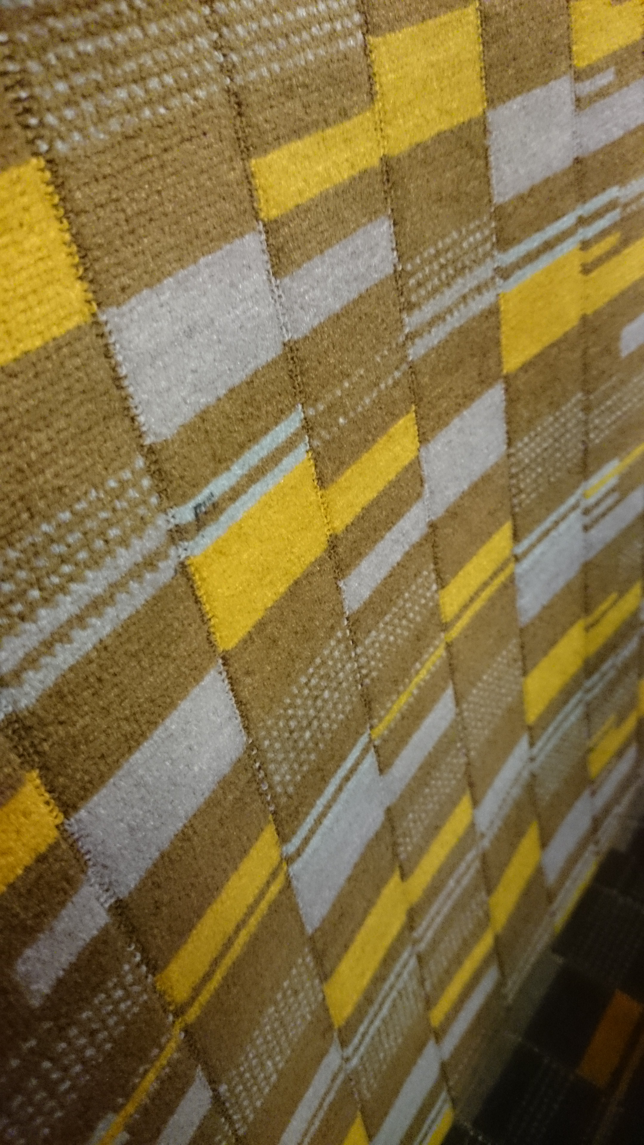

As noted that I was interested in the variations of tube stations. I was interested in the bold seat patterns. The first image reminding me of wallpapers from the 1960s.
These two both consist of simple shapes, layered with clashing colours. I think it is that because these colours are not pleasing to the eye is why I like them. I like the fact that these colours can be an act of discomfort.
“blue and green should never be seen”

I can not help but draw myself textures, this is perhaps the best photo I had taken throughout the whole day of being in London.
It was a box displaying various cocktails you could buy, however these cocktails were non-existent as this three dimensional box was on a grey empty building. What caught my attention was the colour, if it wasn’t for this I would not of noticed it.
I like that the colour suggests that this potential cocktail place is/was vibrant but the peeling paint suggests otherwise.
I feel like I have captured the textures well and I think this would look good as a continuous print, I would experiment with various colours, but because of what attracted me most I would continue to use vibrant colours. However if this was to be a print, I think the line across the middle would be too central unless multiple gaps were to be edited or removed using photoshop.
